

Initial situation
As a rule, charts created by default in Excel are not immediately usable and require revision.
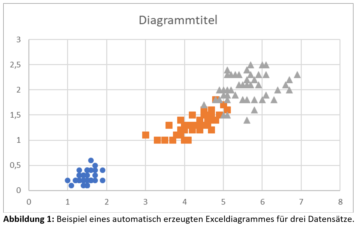
Figure 1 shows an example of an automatically generated Excel chart with three datasets, based on the publicly available “Iris flower data set”. This dataset is often used as an example for discriminant analyses and as a test dataset for various statistical classification methods.

Adjusting charts
The following section explains general aspects for a successful presentation of Excel charts. Depending on the application area and research question, however, deviations from these may also be appropriate.
It is therefore important to consider the specific requirements and objectives of each analysis and to make corresponding adjustments where necessary.

Points and lines
Data points should be displayed as points, while calculated or fitted curves should be shown as lines.
Remove unnecessary elements
First, remove the chart title, the gridlines, and the border around the chart.

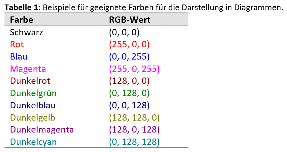
Choose bold colors
For improved readability and better contrast, always use black text color for axis labels and black axes.
Examples of suitable colors and their corresponding RGB values are listed in Table 1:
Format numbers
When formatting the numerical values on the axes, ensure an appropriate number of decimal places and avoid unnecessary zeros.
Make sure that all numbers have the same number of decimal places. Always ensure an appropriate font size corresponding to the purpose of the chart.
Format and label axes
When labeling axes, follow the DIN EN ISO 80000-1, Chapter 7.
- Axis titles may be bold, but this is not mandatory.
- Ensure that the two axes always intersect at the bottom left of the chart.
- Always use an appropriate font size that suits the purpose of the chart.

Insert legend
If you display more than one dataset in the chart, it is important to insert a legend to identify and distinguish the different data series clearly.
The legend can be optionally enclosed by a border to visually separate it from the rest of the chart.

Fitting functions
Always display fitting functions such as a linear trendline as a line in the chart. If possible, include the fitting function and the coefficient of determination directly in the chart.
If you need the parameters of a linear fit of the form y = mx + b, in other words the slope m and the intercept b of your experimental data, it is important not to use the values displayed from the chart’s linear trendline.
Instead, calculate them dynamically in the Excel worksheet, for example using the Excel functions =SLOPE(…) and =INTERCEPT(…).


Result
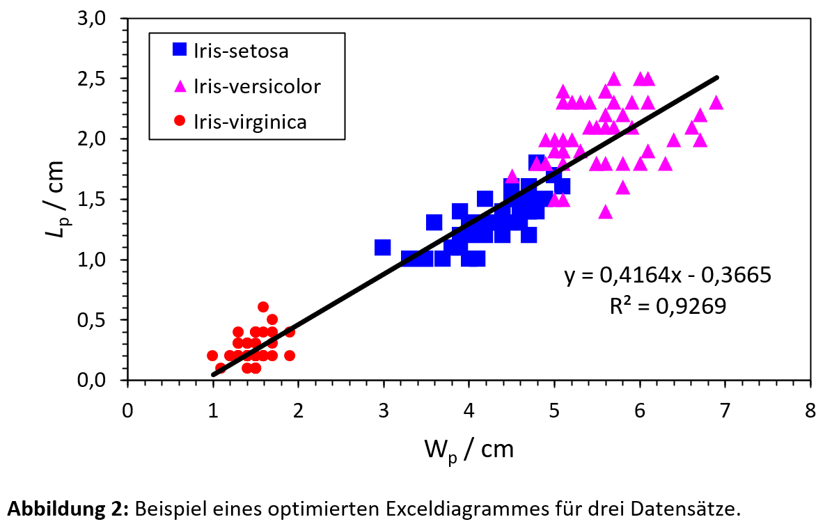
Figure 2 shows the optimized version of the chart:

Frequently asked questions
Can I use charts from Excel in my paper?
As a rule, charts created by default in Excel are not immediately usable and require revision.
Which aspects should I check in my Excel charts?
During your revision, pay attention to removing unnecessary elements, using contrasting colors, formatting numbers, labeling axes, adding a legend, and defining fitting functions.
Continue browsing


This article was published in October 2025 and last updated in February 2025.